Quick Overview
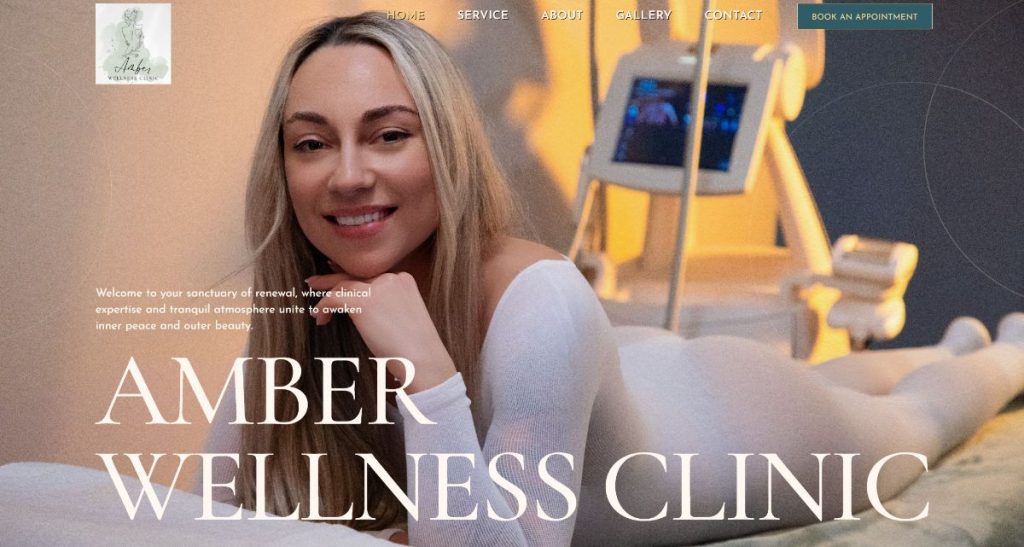
AmberWellness is a beauty and wellness business based in East Tilbury, focused on helping women improve skin health, reduce discomfort and rebuild confidence. In 2025, the business required its first website to establish a professional online presence and support local visibility.
This project was delivered for AmberWellness, based on Princess Margaret Road, offering a range of treatments in a calm, client-focused environment.
The Starting Point
At the start, there was no website.
The business operated through:
- A Facebook page
- An Instagram account
Which is common.
But it creates limitations.
Social media can support a business –
but it doesn’t replace having a structured, central place where people can properly understand what’s offered.
There was no single place where:
- Services were clearly explained
- Questions were answered
- Trust could be built properly
The Real Problem
The issue wasn’t visibility alone.
It was credibility and clarity.
When potential clients look for treatments like these, they’re not just browsing.
They want reassurance.
- What exactly is the treatment?
- Is it safe?
- What results can I expect?
- Who is providing it?
Without a website, all of that becomes harder to communicate.
In many cases, this is exactly what we see in businesses with no online presence or poor visibility.
The decision to act came from a simple place:
To be taken seriously, the business needed a proper online foundation.
What We Built
Bespoke Website Design & Development
A custom 5-page website was designed and developed.
Simple on the surface –
but structured carefully.
The goal was to create a clean, calming experience that reflects the nature of the business.
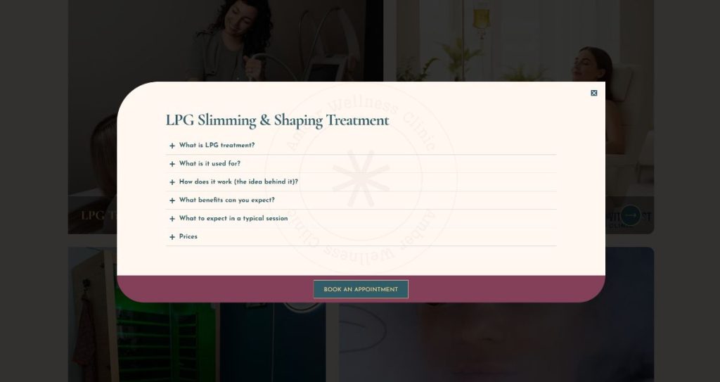
Service Page Structure (Key Decision)
Instead of long, heavy pages with endless scrolling, we structured the services differently.
Each service includes:
- A clear overview
- A button to open a detailed popup
Inside the popup:
- Full explanation
- FAQs
- Key details
This allows users to:
- Access information quickly
- Avoid being overwhelmed
- Find answers without needing to call or message
Visual Presentation
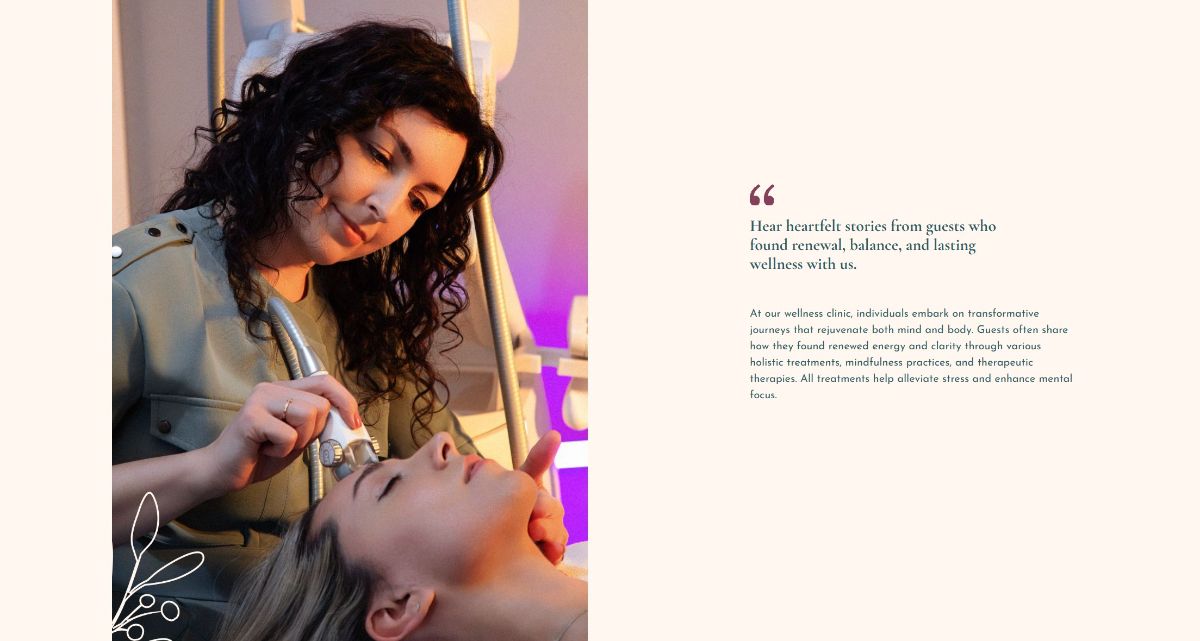
One of the strongest elements of this project was the photography.
The business had invested in professional photos – and it shows.
We built the design around that:
- Clean layouts
- Strong image placement
- Consistent visual tone
A dedicated gallery was also implemented with filtering options:
- Results
- Services
- Qualifications
This makes it easier for visitors to explore specific areas without friction.
Technical & Interaction Layer
To enhance the experience:
- Subtle scroll effects were added on the homepage
- Smooth interactions guide users through services
- Lightweight animations were used carefully
These were implemented in a controlled way to avoid impacting performance or SEO foundations.
Key Decisions & Trade-offs
We deliberately kept the site:
- Small
- Focused
- Easy to manage
No unnecessary pages.
No feature overload.
The priority was clarity and usability – not complexity.
This is often more effective for local service businesses.
Results (What Actually Changed)
The business now has:
- A clear, professional online presence
- A structured way to present services
- A central place to build trust with new clients
It’s now much easier for potential customers to:
- Understand treatments
- View real results
- Feel confident before making contact
In practical terms:
It moved from
“social-only presence”
to
“structured, credible business”
This kind of shift often addresses the same issues highlighted in why websites fail to convert, particularly around trust and clarity.
Client Type
This was an owner-led business.
Hands-on, detail-focused and clear about the type of experience they wanted to create for clients.
A Real Moment
One thing that stood out was the attention to detail – especially around visuals.
Having high-quality photography made a noticeable difference to the final result.
After launch, the client shared:
“Excellent work! Everything was done exactly as I imagined, and everything was presented very clearly and professionally 👌 Highly recommended!”
What This Case Shows
For local service businesses, a website doesn’t need to be large.
But it does need to be:
- Clear
- Structured
- Trust-focused
Without that, potential clients hesitate.
With it, the decision process becomes much easier.
Final Thought
For many small businesses, the first website isn’t about scale.
It’s about getting the foundation right.
This is where structured builds differ from typical web design Essex approaches that prioritise speed over long-term performance.