Quick Overview
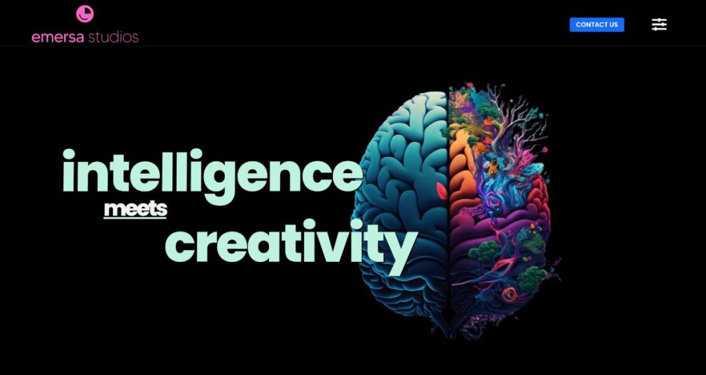
Emersa Studios is a London-based production and technology studio operating across broadcast facilities, virtual production and immersive XR environments. In 2025, the business required a complete website rebuild to better reflect its capabilities, positioning and the level of innovation it delivers.
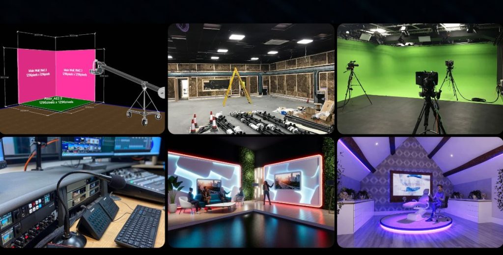
This project was delivered for Emersa Studios, based at Great Portland Street, London, offering advanced production services ranging from corporate streaming to virtual environments and XR experiences.
The Starting Point
The existing website wasn’t broken – but it was clearly behind.
It felt old.
Not fully responsive.
Some information was outdated.
More importantly, it didn’t reflect the actual business.
This is a company working with:
- Virtual production
- Broadcast technology
- Immersive environments
But the website didn’t communicate any of that.
There was a disconnect between what the business does and how it appeared online.
The Real Problem
This wasn’t just about updating content.
It was about perception.
When someone lands on a website like this, especially in a technical or creative industry, there’s an expectation:
- It should feel modern
- It should feel innovative
- It should reflect the level of work behind it
In this case, it didn’t.
In many cases, this gap between capability and perception is exactly what we see in businesses with no online presence or poor visibility.
The goal wasn’t just to improve usability –
it was to create something that immediately signals:
“This is a serious, forward-thinking studio.”
What We Built
We approached this as a full rebuild, not a refresh.
Bespoke Website Design & Development
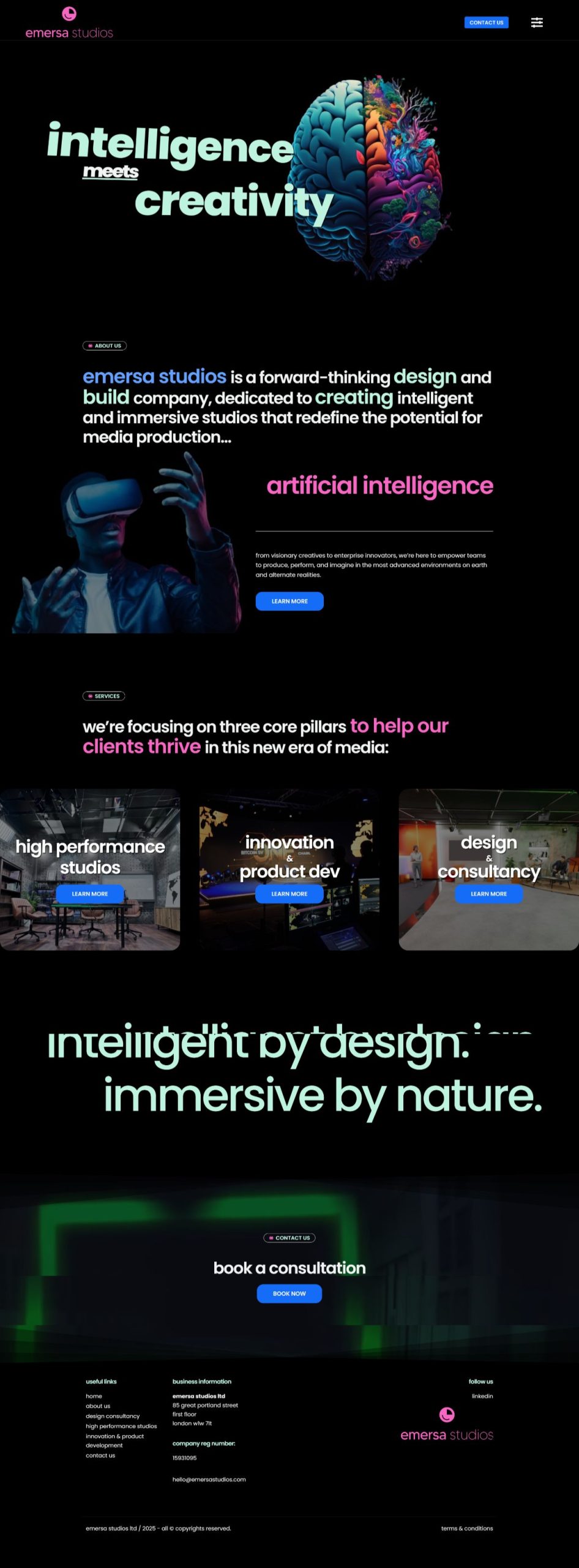
A completely custom website was designed and developed to reflect the studio’s positioning.
No templates.
No shortcuts.
The focus was on:
- Strong visual identity
- Clear service communication
- Structured page flow
- Fully responsive layout
Everything was built around how users experience the brand, not just how it looks.
Visual Direction & Experience
The design direction leaned into:
- Futuristic styling
- Clean but bold layouts
- High-impact first impressions
The aim wasn’t to overload the site with effects –
but to create a controlled “wow factor” that feels intentional.
Technical & Interaction Layer
To support that experience, we introduced:
- Smooth on-scroll animations
- Subtle motion to guide attention
- Structured transitions between sections
These weren’t added for decoration.
They were also implemented in a controlled way to avoid negatively impacting performance or SEO foundations.
They were used to:
- Improve flow
- Keep users engaged
- Reinforce the studio’s innovative positioning
Key Decisions & Trade-offs
We deliberately avoided:
- Overusing heavy animation
- Slowing the site down with unnecessary effects
- Prioritising visuals over usability
In projects like this, it’s easy to go too far.
The goal was balance:
Visually strong
But still fast, usable and structured
Results (What Actually Changed)
The biggest difference is in how the business is now perceived.
- The website now aligns with the level of work the studio actually delivers
- It creates a stronger first impression for new clients and partners
- Services are clearer and easier to understand
- The business presents itself as more established and technically capable
In practical terms:
It moved from
“outdated and disconnected”
to
“aligned, modern and credible”
This kind of shift often addresses the same underlying issues highlighted in why websites fail to convert, particularly around clarity, trust and user experience.
Following the launch, the business also saw increased interest and enquiries, along with new project opportunities driven by referrals and stronger first impressions.
Client Type
This was an established business operating in a highly technical and competitive space.
The focus wasn’t on “getting online”
it was on representing the business properly.
A Real Moment
One thing that stood out after launch:
The project didn’t just improve the website –
it led to further work.
The business referred additional projects and continued collaboration based on the result.
Which, in many cases, is a stronger signal than any single metric.
What This Case Shows
In industries built around innovation, perception matters.
If the website feels behind, it creates doubt – even if the work itself is strong.
A well-structured, properly built website doesn’t just present the business.
It reinforces it.
Final Thought
Websites in technical industries need to do more than exist. They need to reflect capability, clarity and direction. This is where structured builds differ from typical web design Essex approaches that prioritise speed over long-term performance.